2013-2016
Concerto 2
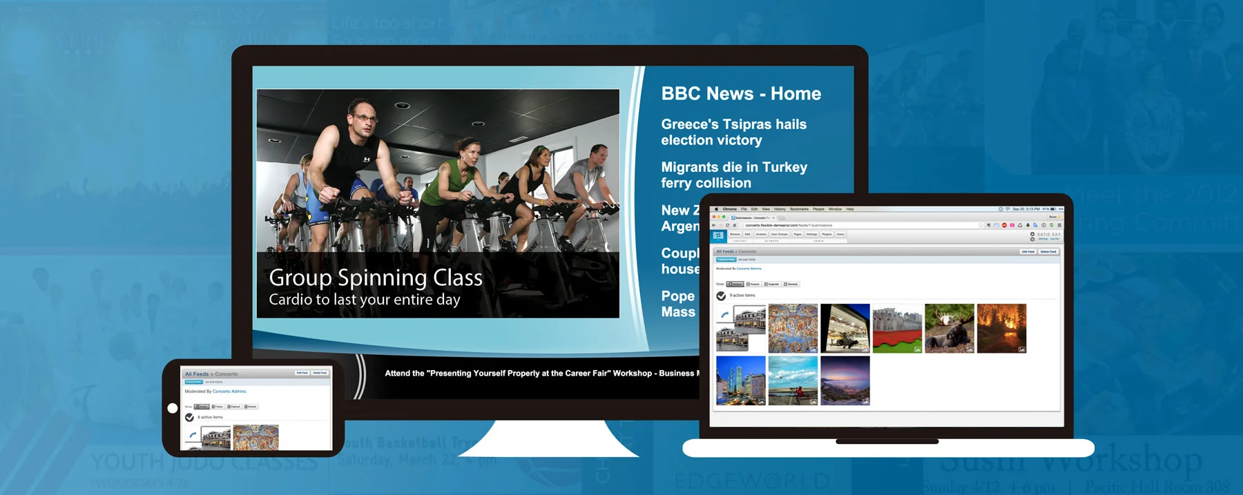
Concerto is an open source digital signage platform for sharing multimedia advertisements within communities. In its most basic form, it's a way of posting and managing community advertisements on flat panel televisions and other screens.
MY ROLES
Interaction Design, Branding, UI Engineering, Visual Design
COMPANY
Self-Started
Building on Version One
The first version of Concerto launched while I was still in college at RPI. I worked with a group of six other core team members—all engineers—and led the user experience design for the team. Designing Concerto 1.0 and its subsequent releases was a completely green-field endeavor—we defined the product requirements and mostly designed the software that we ourselves, as students, wanted to use to help publicize our clubs’ events on campus.
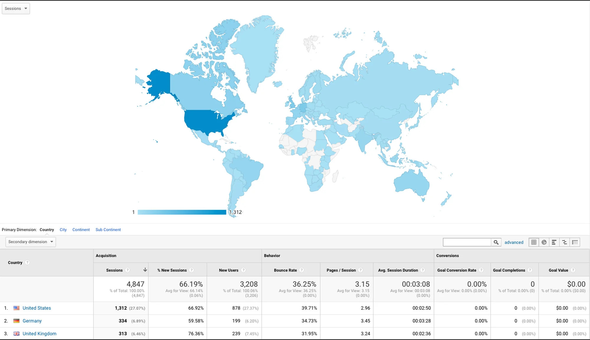
For 2.0, we had a much larger base of feedback at our disposal. The response to 1.0 was simply incredible. The source code was downloaded by people in over 70 countries and the Google Group we set up included legions of excited people. People would regularly send our team emails about how much they loved Concerto, especially how easy it was for them to set up and put into use within their own user communities.
Considering the feedback we had received, we identified some core objectives for the second release:
- Refine the core flows of Concerto 2 based on what worked well and not as well in Version 1. Content moderation was particularly clunky and disjointed.
- Re-focus the experience on content.
- Move to a new technology stack based on Ruby on Rails.
- Introduce an integrated plugin system for expanding the functionality of the system.
The Concerto public website is visited by people from most of the world on a monthly basis, with a publicly available GitHub repo.
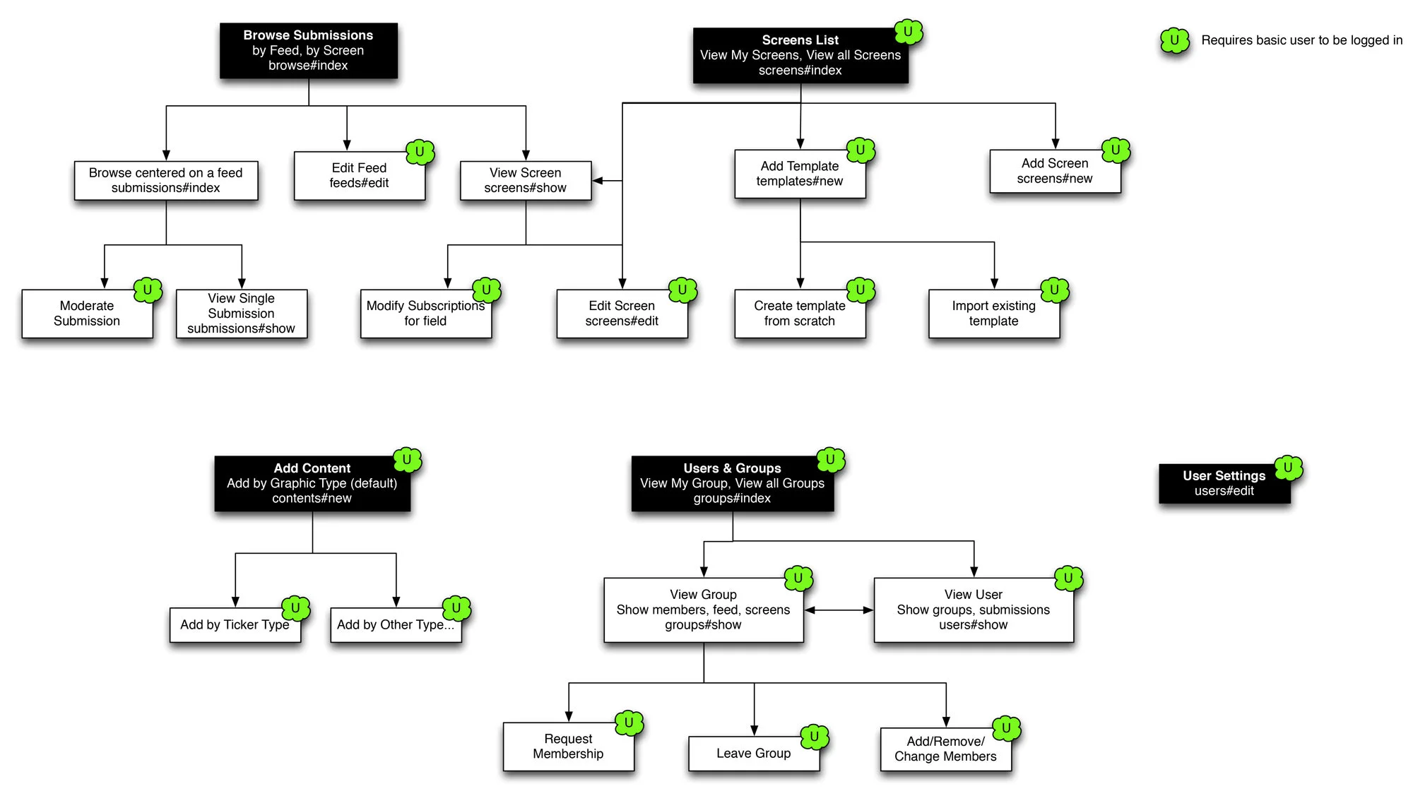
Information Architecture (IA) and Menu
Because plugins would be coming into the mix with Concerto 2, I wanted the organization of the administration interface to support groups of interrelated pages. I developed a simple one-tier grouping of menu tabs for the main menu that could also grow naturally as Concerto plugins add new pages to the application. The full menu is replaced by a much simpler presentation when no user is logged in.
Concept Development
Add Content
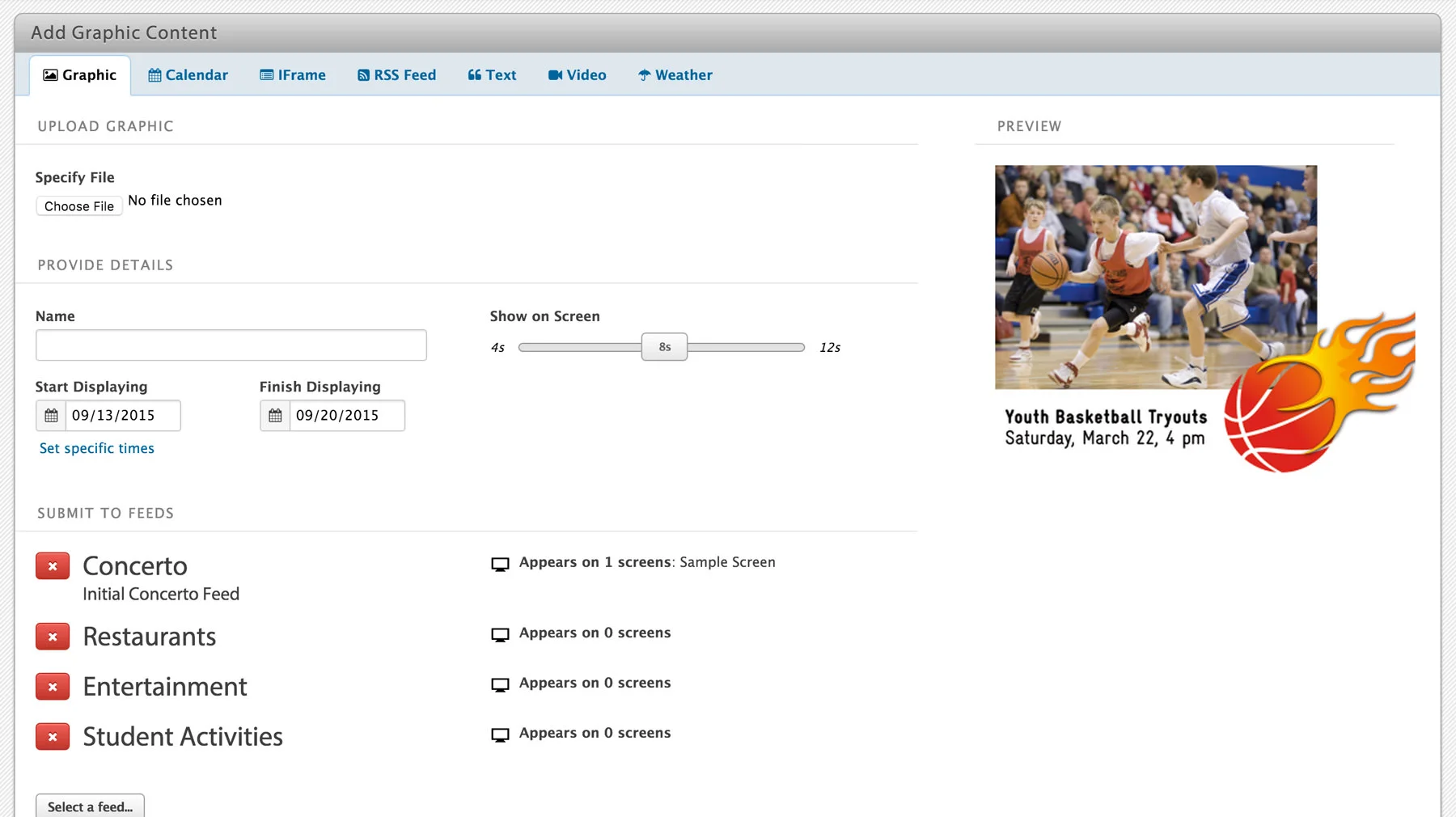
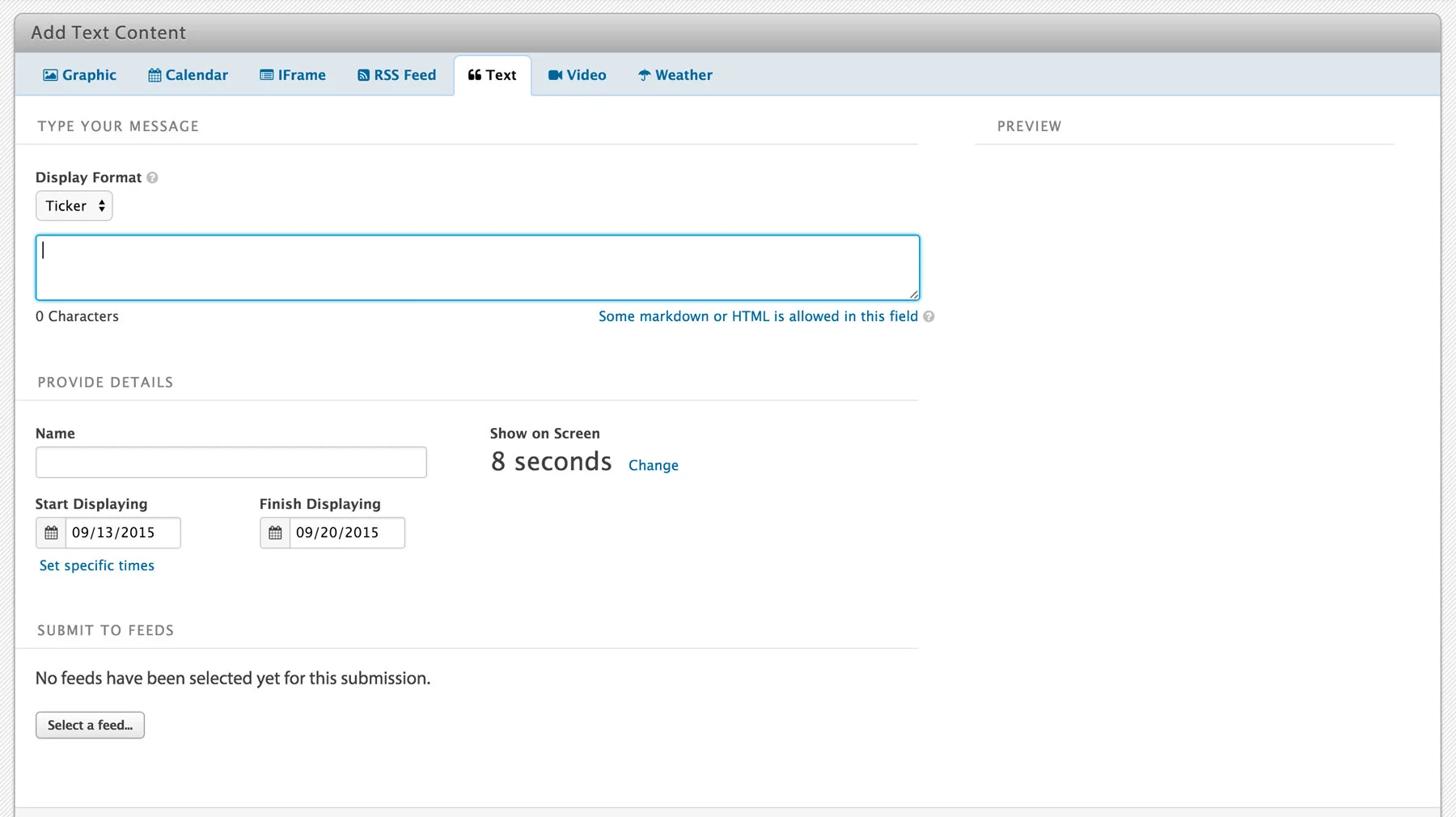
In 1.0, content creation was done through one page with an inflexible set of horizontal tabs. With the promise of Concerto 2 plugins adding new types of content, I needed to come up with a more flexible design. I organized this area around the type of content and employed a tab group that could be expanded with plugins. Each content type can ask for different things from the content submitter.
One thing that became apparent from conducting user tests of the 1.0 UI was the need for a content preview to ensure the advertisement looked right before submission. I worked with other members of the team to design a simple live preview that would show the new ad before choosing to submit. This proved a bit tricky because we needed to stream data from the client browser and create a kind of temporary record of the media file before the full content record was actually created.
Browse and Moderate Content
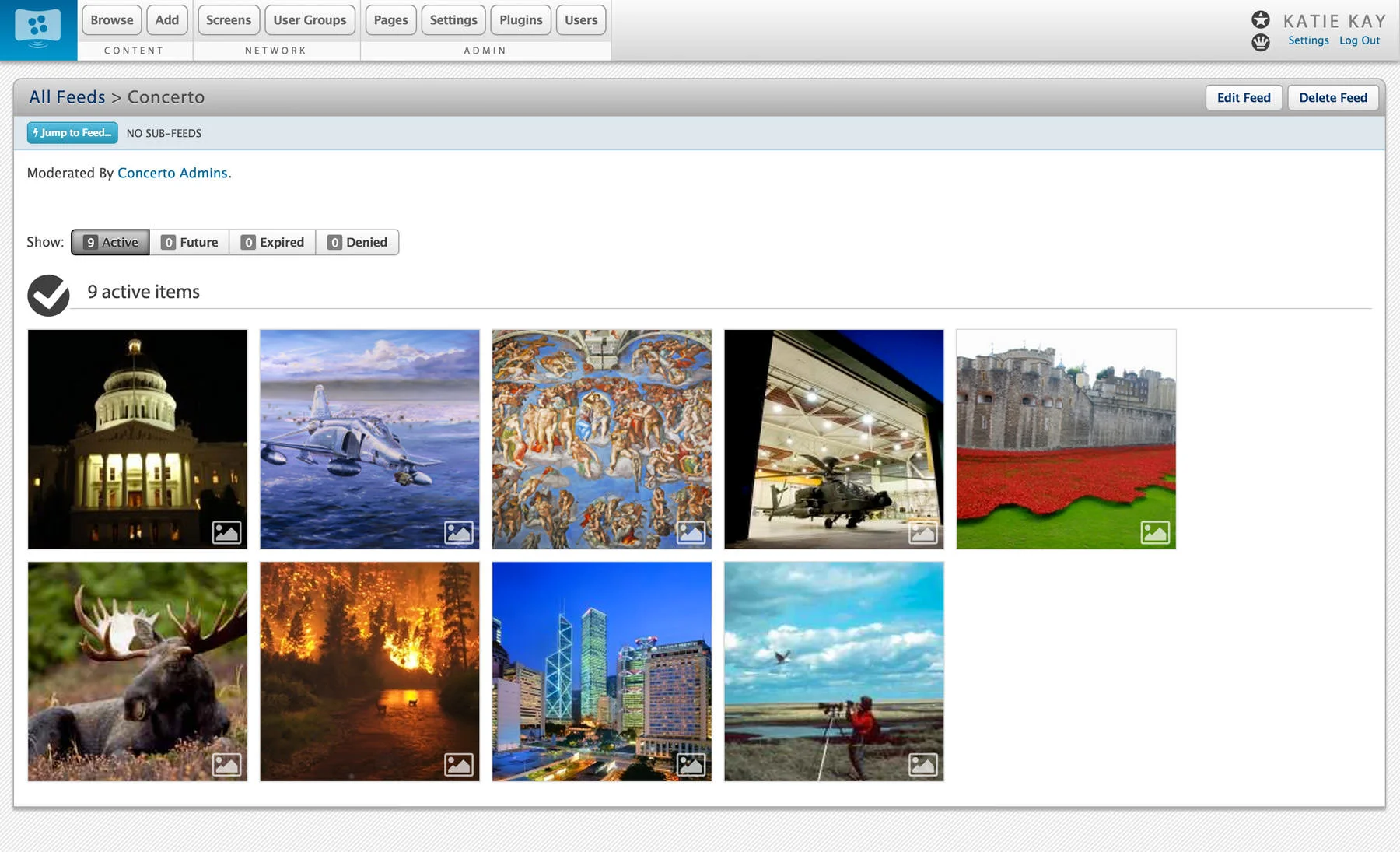
The user goal through this flow is to approve or deny advertisements added to Concerto by others within their organizations. I sought to embed the moderation process directly into the content browsing interface. If the current user has moderation privileges, they simply see contextual controls layered over the content in their view. This also made these interfaces easier for the team to build.
Screen Management
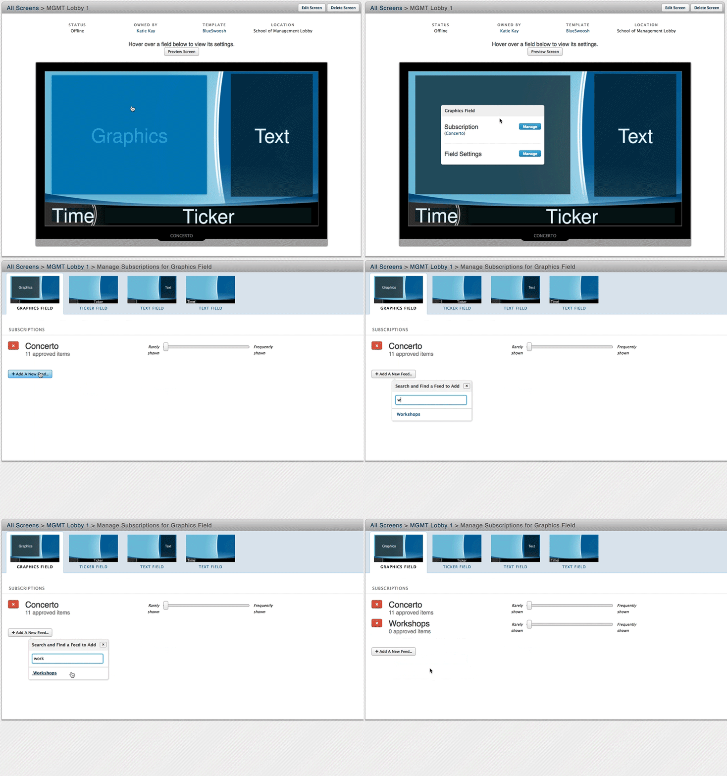
Concerto 1 used a list interface to manage screen content type subscriptions. For Concerto 2, I developed a simple interface allowing the user to see and manage the actual screen regions and subscriptions in a visual way.
Release
Concerto 2.0 was finally released to the world in June 2014. Since then, the product has been downloaded many thousands of times and has expanded the reach of the project to a much large audience. Try the product and download it at concerto-signage.org!


