2019-2020
Dash Studio
Dash Studio is the revamped drag-and-drop dashboarding tool for AppDynamics. As the Product Manager, I built the vision, product vision, and roadmap, working closely with engineers and designers to bring the new product to market.
MY ROLES
Product Management, Roadmaps, Customer Research, Agile Planning
COMPANY
AppDynamics (Cisco)
Problem
Keeping Up with the Times
Some months after launching Particle with my team, I became the Product Manager for AppDynamics Dashboards. Visual dashboards are critical tools for conveying critical performance data. They allow custom mashups of data in a pleasing style that can be shared with others.
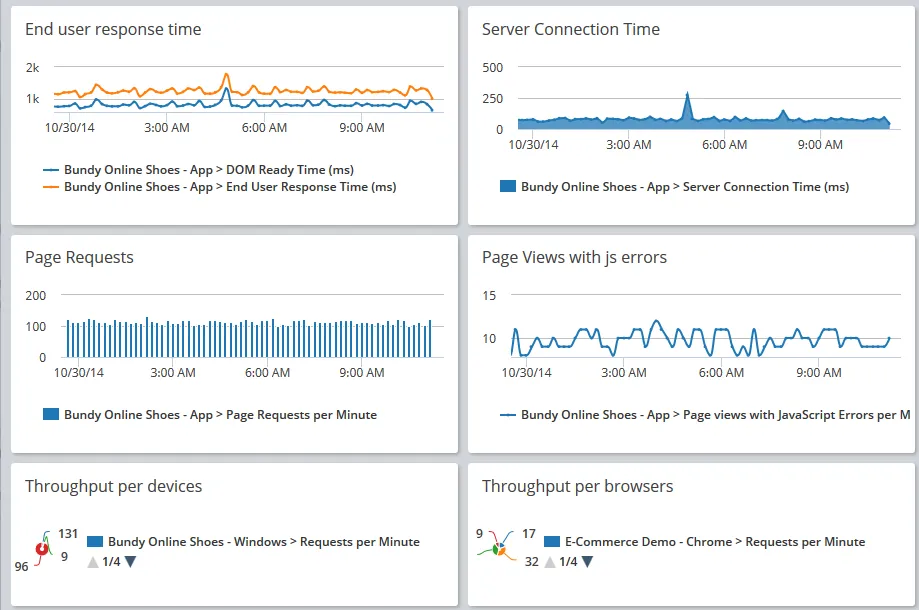
Custom Dashboards had been in AppDynamics since the product's first version a decade earlier. Over that time, customer complaints had piled up about the high degree of effort and time needed to create good dashboards. Several attempts had failed to remake the platform in the midst of competition from newer tools such as Grafana. The existing product was built on outdated absolute positioning systems that were brittle and difficult to edit. Even so, Custom Dashboards represented over 70% of the day-to-day page views across all of AppDynamics, with over 100,000 new dashboards created each year. They were too critical to ignore.
The previous Product Manager understood that change was needed and had spun up another effort, but it was far from market-ready. Upon inheriting the project, my goals were to evaluate the foundational work that had been done so far, re-engage with customers, build a prioritized roadmap, and work with the team to finally bring it to market. This is how Dash Studio was born.
Analysis & Vision
Engaging the Dashboards Community
I focused on re-engaging and growing the user group, interacting with users across many customers via the AppDynamics Community forums, and conducting direct feedback sessions to holistically analyze the role of Custom Dashboards at a variety of customers.
From these interactions, I learned that:
- Thousands of dashboards had been built in the old system using very rudimentary and brittle approaches, such as layered SVGs to make traffic light performance rollups.
- The out-of-the-box widgets and controls were too basic and ugly.
- The existing tool presented layers of confusing popup windows that caused lots of frustration.
- A complex dashboard could take hours and hours and an academic degree to build. One power user said it took him 28 hours to build one of his team's most critical dashboards!
- Building a great dashboard was often so complex that customers needed to engage with our Professional Services team. The onboarding experience was also nonexistent.
- Custom Dashboards felt disconnected and separate from the rest of the product, but teams turned to them because most of the other AppD screens were inflexible and lacked the information they needed.
I conducted competitive and secondary research and found that Datadog, Dynatrace, and New Relic had all overhauled their dashboarding tools. I decided to continue down the path of building a new dashboards platform that could eventually power data visualization across all of AppDynamics. While I understood that a significant redesign would present risk and customer pain, it aligned with the long-term strategy for the company.
Planning
Priorities, Roadmap, and User Stories
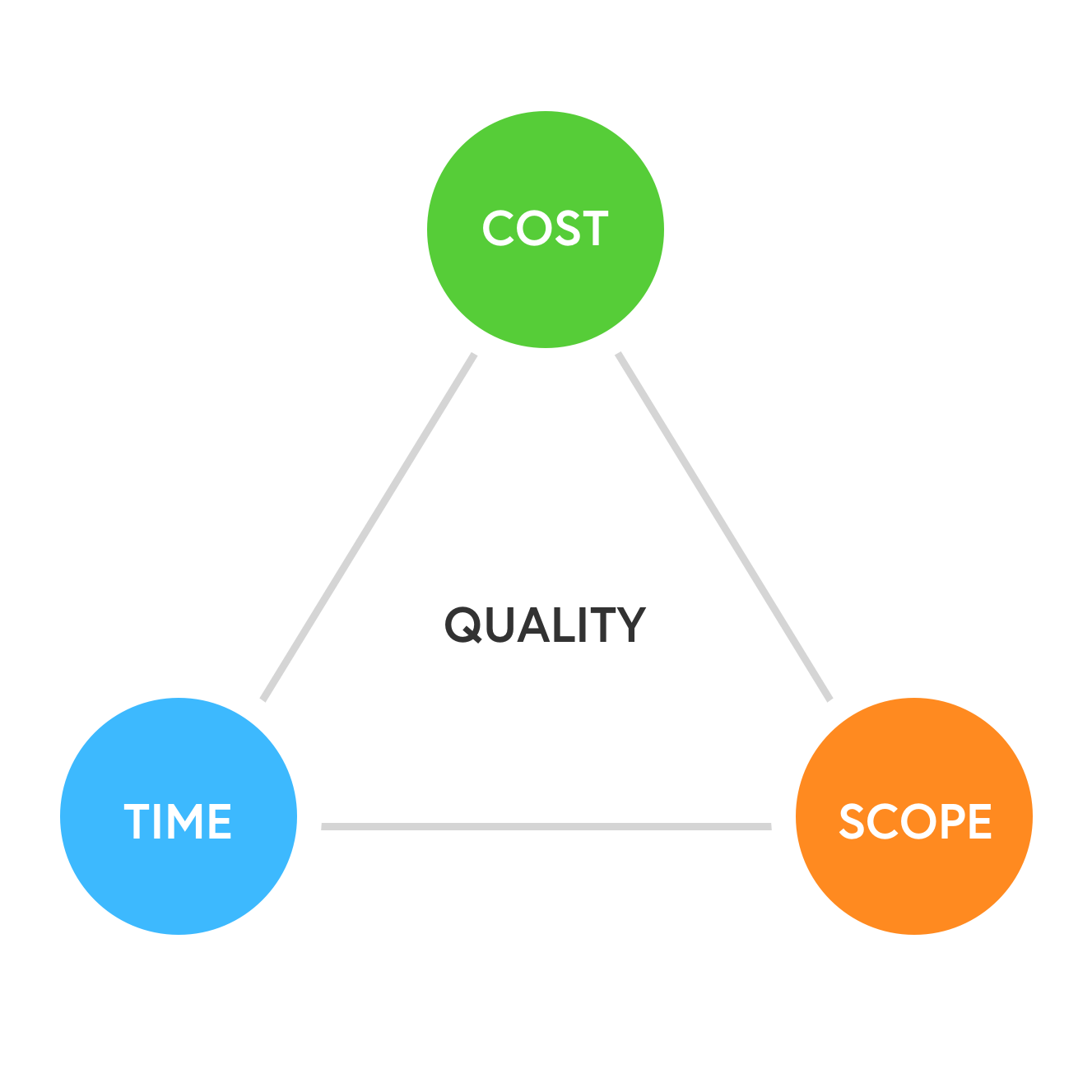
In a perfect world, we'd be able to build the ideal product in as much time as it needed. But in reality, we must make smart compromises in order to achieve quality. This challenge is often illustrated using the PM Triangle: Cost, Time, and Scope.
The Dash Studio team, while not large, included talented developers and QA engineers. Due to customer escalations, executives set the expectation that we'd have to ship something within 6-9 months. So my main level to pull was Scope.
I wanted to establish a “Minimum Lovable Product” (MLP) that would do the most important things for users while feeding a longer-term roadmap. I built a sort of “Maslow's Hierarchy of Dashboarding Needs” with three priority buckets:
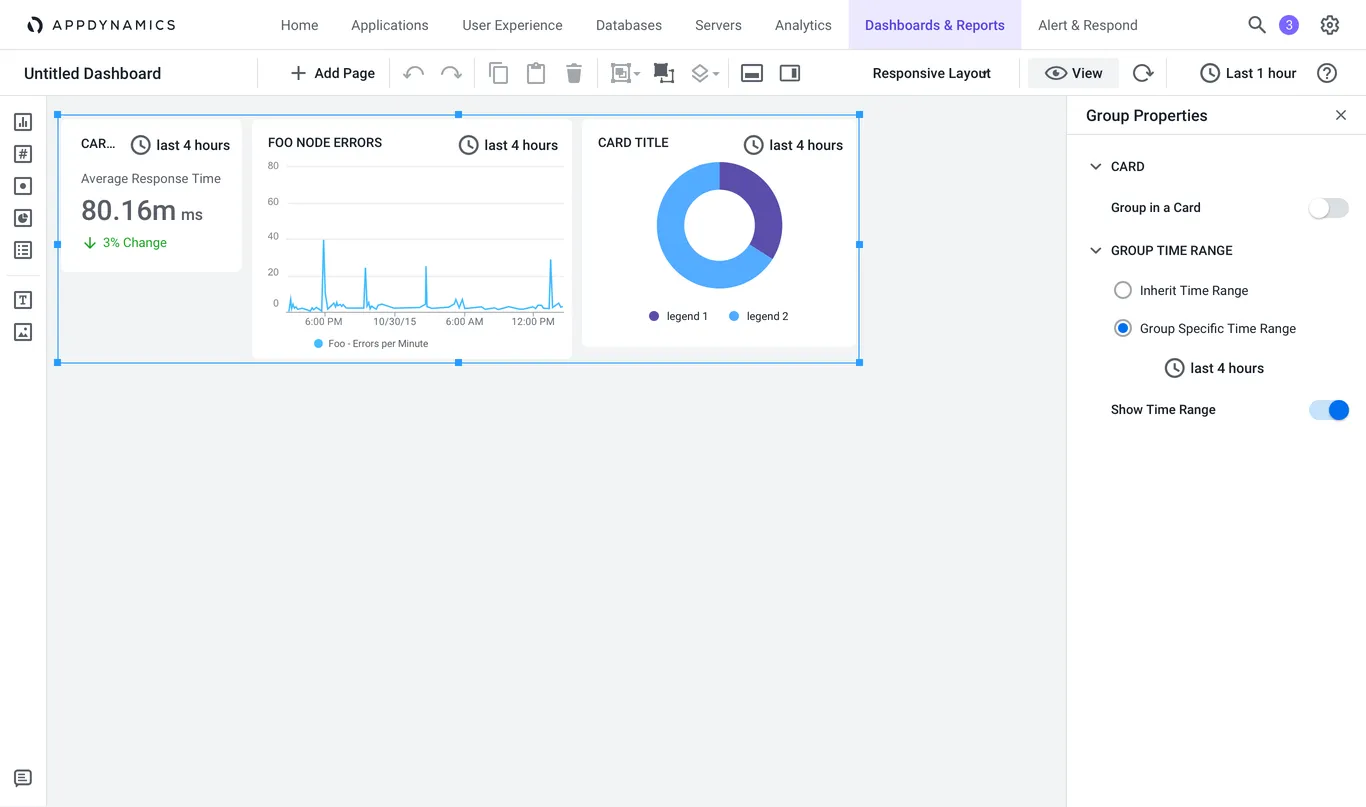
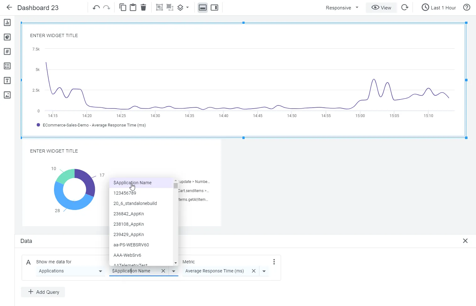
- Priority 1: Dashboard authoring and responsive layouts to greatly reduce the time to value and improve satisfaction. We needed to have an elegant data binding experience that allowed users to create dashboards in minutes.
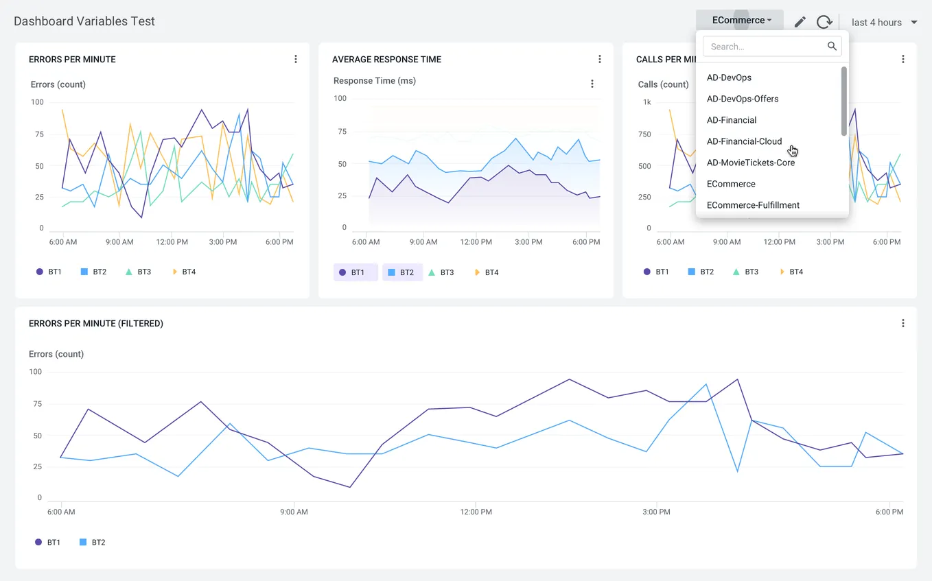
- Priority 2: Beautiful, powerful out-of-the-box data visualizations. Our new widgets needed to address a wide range of use cases, scale to large datasets with excellent performance, and look beautiful on any screen.
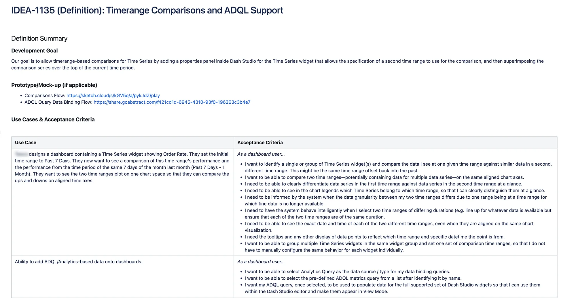
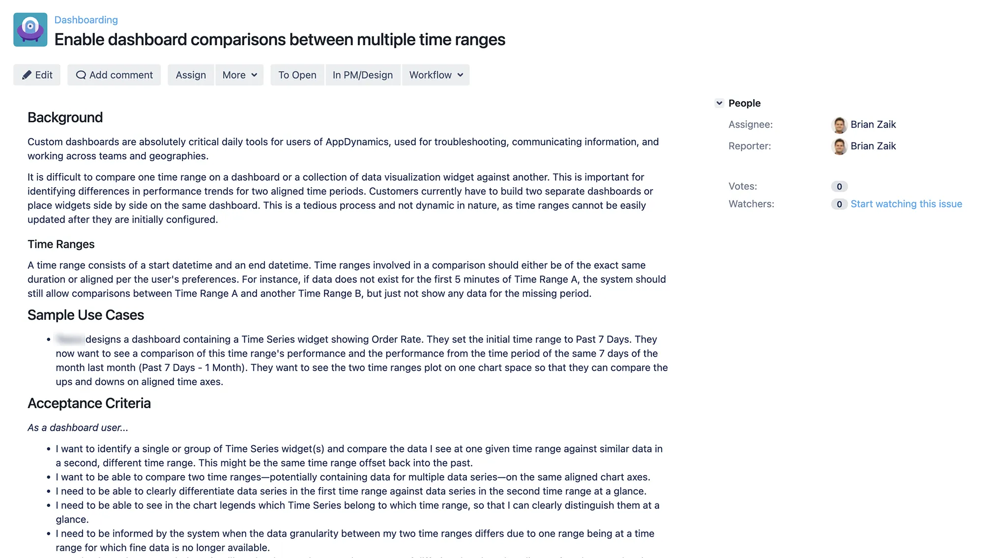
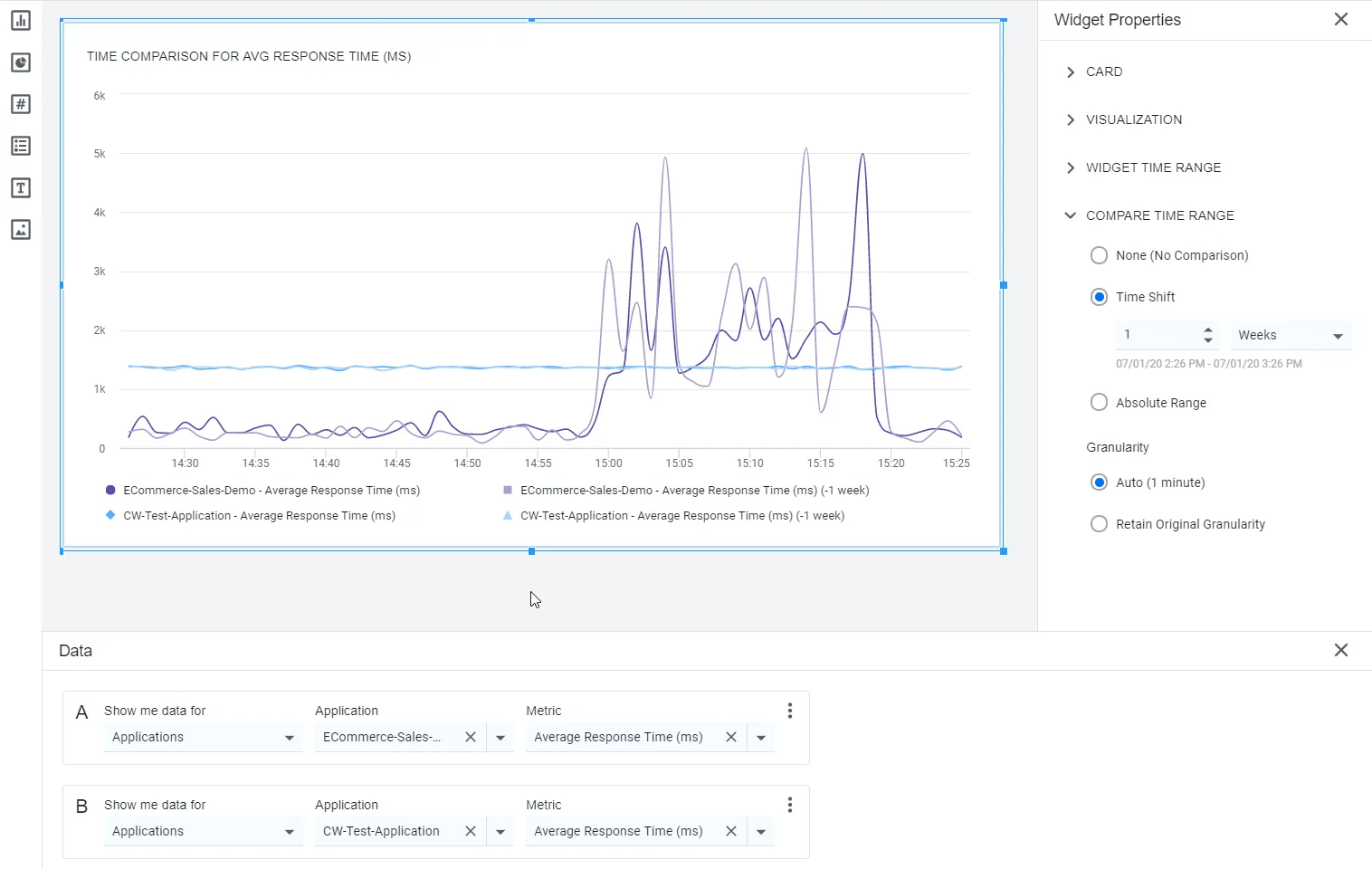
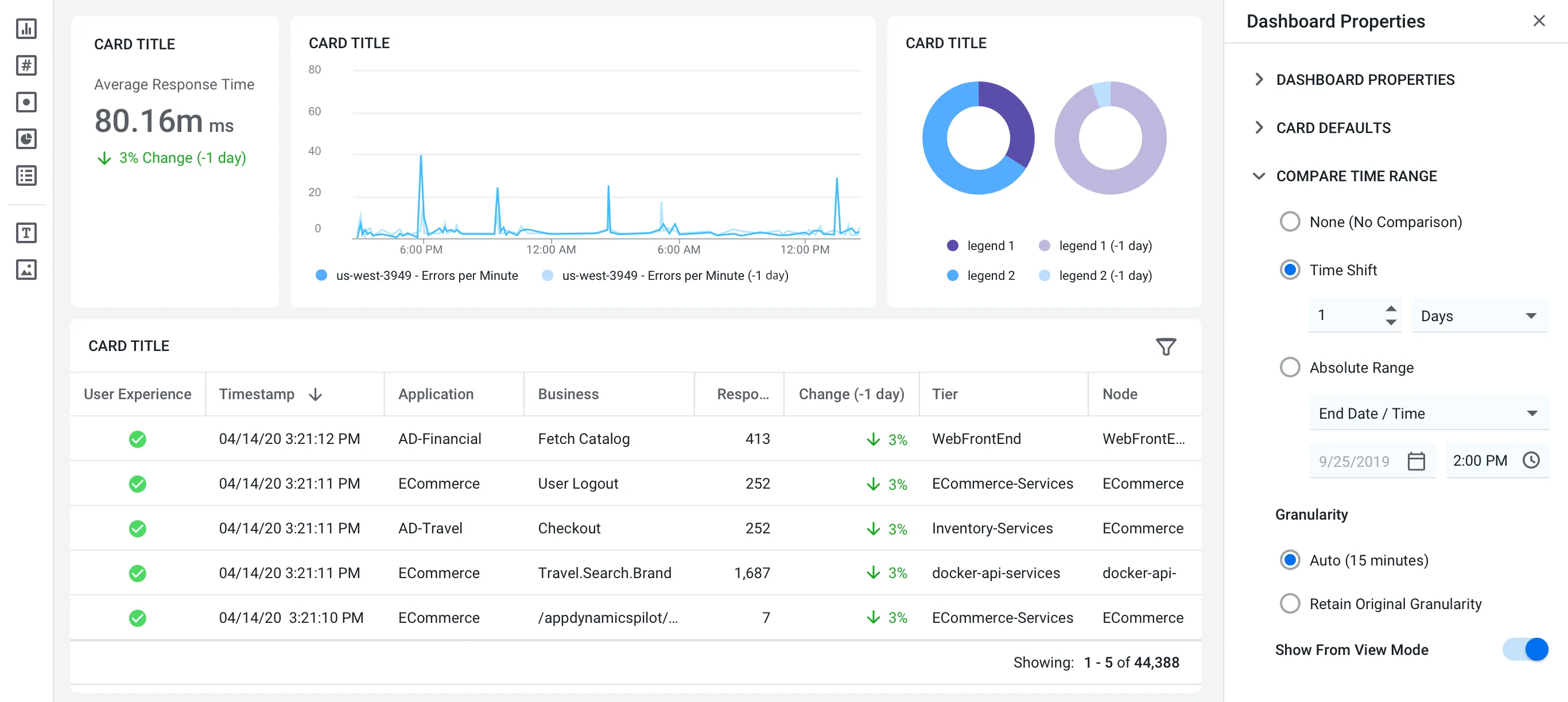
- Priority 3: Specialized use cases for collaboration and time range comparisons. These included much simpler dashboard sharing and comparing datasets for critical business events, such as Black Friday for retail customers.
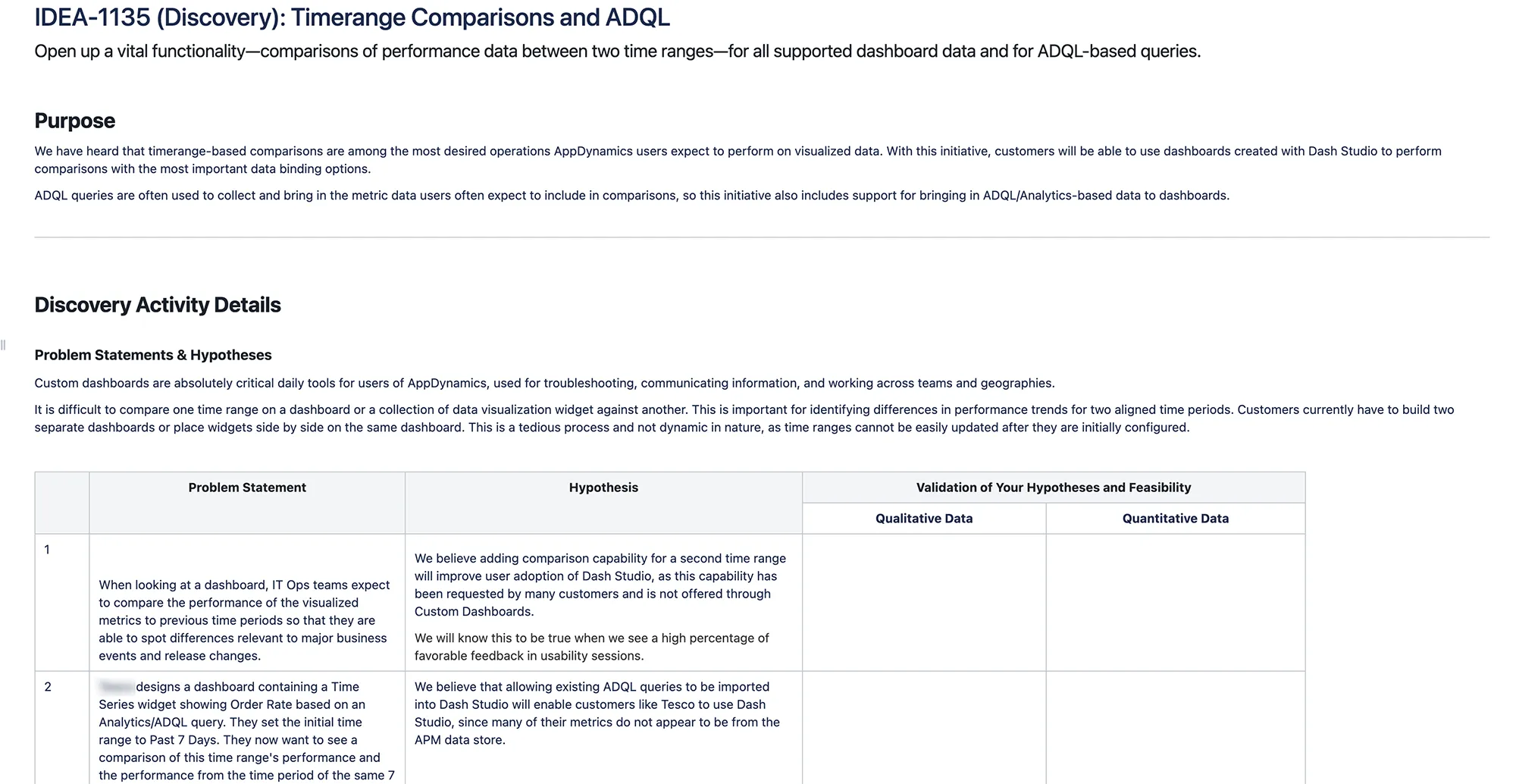
I created a roadmap and worked closely with the Design and Engineering teams to develop T-shirt estimates of the effort. I also got very involved with developing epics, user stories, and general acceptance criteria around UI performance, accessibility, and screen resolutions.
Build
Making Dash Studio a Reality
Using new prototyping tools including Sketch, Abstract, and our homegrown UI Kit components, we worked closely to create and launch the new product. With my roadmap and requirements in hand, designers developed a whole bunch of interaction flows and designed the new UI. The layers of popup windows were replaced by drag-and-drop widgets and a responsive canvas. This was familiar to people who had used PowerPoint and Keynote, Adobe creative tools such as Photoshop, and diagram tools like Mural and Miro.
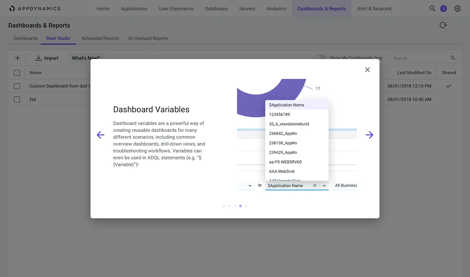
I pushed the team to prototype multiple iterations of each major epic and user story. We “dogfooded” them within AppDynamics and held user testing sessions with active customers. Dashboard widgets and layouts were built as UI Kit components so that they could be shared across all of AppDynamics. To improve discoverability and promote new functionality, I included requirements for each user-facing epic to build "What's New?" content and inline help.
As the Product Manager, this was an amazing opportunity to get involved with virtually every agile activity as the product came together. I attended team standups, gave roadmap shareouts during agile planning sessions, and previewed in-development functionality as soon as it became available in our prototyping and testing environments. This helped build trust and alignment across the team and made the work fulfilling.
Results
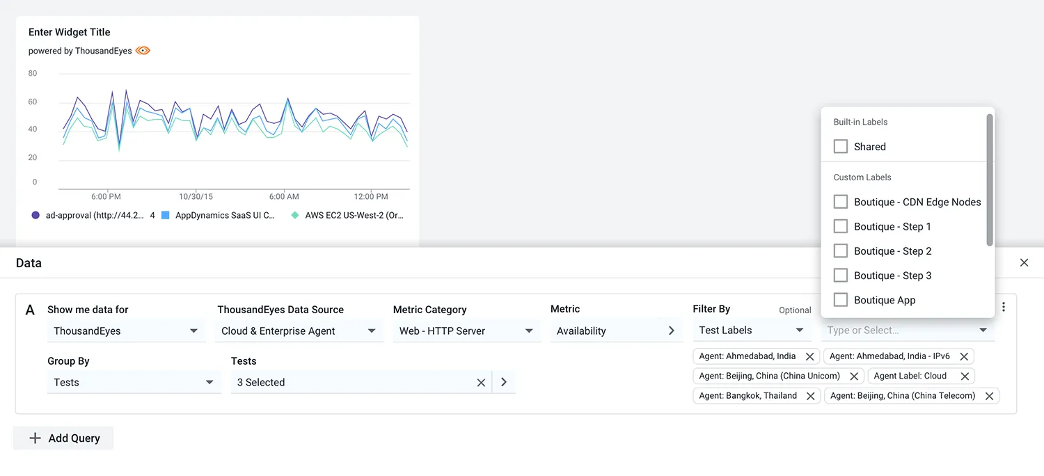
Dash Studio launched as a beta (”Preview Mode”) after about 8 months of development. Within the first three weeks, over 35% of AppD customers had built dashboards in the new tool. Users found Dash Studio to be a big improvement, praising its ease of use and modern look and feel. I set up a roadmap of improvements and refinements that fed multiple subsequent years of product development. We also integrated other Cisco products, such as ThousandEyes, into Dash Studio.
We were not able to have feature parity with everything the older Custom Dashboards system featured, which held back customer adoption. In Preview, Dash Studio was available to all 3,000+ AppD customers in parallel with the old system so that they could take time to move on, without having their old dashboards go away. While customers were creating thousands of dashboards in Studio, they were still clinging to their work in the old system. I discussed migration strategies with the development team, including automated data and layout conversion concepts.
Dash Studio and the new widgets became foundational elements for AppDynamics Cloud, the next-generation product launched in 2022. This is now part of the Cisco FSO Platform, meaning that every FSO user interacts with Dash Studio technologies to get their work done.
Dash Studio makes it super easy to build dashboards. I've got some folks using it and they won't go back to the old way.
-- DevOps Manager, Security Startup
ThousandEyes integration with AppDynamics Dash Studio simplifies management for an IT staff already under tremendous pressure.
-- Mark Leary, Research Director, Network Analytics at IDC
Here's a video of the first release of Dash Studio in action:
Retrospective
- Feature parity for an existing system used by thousands of customers is a difficult and costly goal to attain. Special care needs to be put into thinking through the overall migration strategy to get from old to new. And it needs to be in stages, especially with enterprise customers. You can't force a changeover too abruptly or risk ticking off and turning away your users. We underestimated the complexity of translating existing dashboards to Dash Studio and it has continued to hold back customer adoption.
- Customers also need a very clear value proposition to support moving to a new product. It is true that many people dislike change at first. Expect that a switchover will take a lot longer than you desire.
- In hindsight, I should have given more weight to the option of partnering with an existing dashboards vendor such as Grafana. Building a plugin is a lot less costly than building your own solution in-house, especially when many customers are already familiar with those other tools. I concluded it was important to roll our own solution so that it could be used to power data visualization in the next-generation product, but there were definitely consequences to this approach.
Acknowledgments
I'd like to thank key members of the Dash Studio team: designers Eric Wienke, Saeam Lee, Ian Lin, and Rob Riccetti; engineering leaders Olivier Crameri, Albert Chang, Yin Li, Don Mamaril, and Akshay Phadke; engineers Ryan O'Connell, Junghun Lee, Ram Ponneganti, Henry Bow, Yvonne Feng, and Spencer Yue. Mark Shahinian was the former Dashboards PM, while Dinesh Rajwani was the Technical Program Manager for the initial efforts and has since taken over as Product Manager for Dash Studio.


